Posts

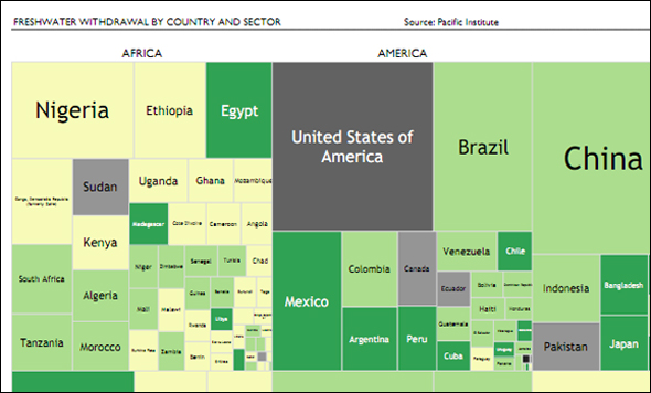
Infographic: Tree Map of Freshwater Withdrawal by Country — A Comparison Between Continents
1 Comment
/
Does the population of a country affects to its freshwater withdrawal? and its geographic location? Are there differences between Continents? and within them? How the availability of freshwater is spread around the economic sectors?

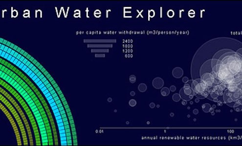
Infographic: Interactive Urban Water Explorer
Entry in the 2011 Urban Water Design Challenge, sponsored by Visualizing.org and Circle of Blue.

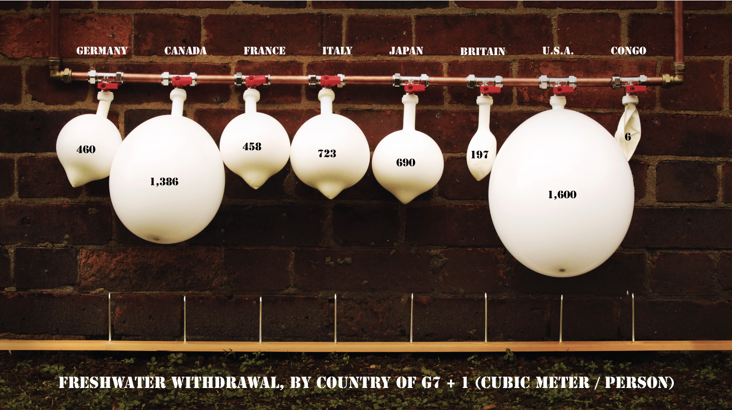
Infographic: Freshwater Withdrawal by G7 Country
This visualization visually and physically describes the freshwater withdrawal per capita from the G7 and another nation.

The Stream, March 23: World Water Ranking
Mauritania, Kuwait and Jordan are the most water-stressed countries…

Visualizing.org Hosts Urban Water Data Visualization Challenge in Collaboration with Circle of Blue
Visualizing.org, the global open data visualization platform created by Seed Media Group and GE, opened its World Water Day data visualization challenge today in collaboration with Circle of Blue, the leading news organization reporting on global water challenges. The challenge calls on designers, data experts, and visualizers to tap into the world’s stream of water data to create visualizations specifically on the topic of urban water.

