
Entry in the 2011 Urban Water Design Challenge, sponsored by Visualizing.org and Circle of Blue.
Paumier submitted this information graphic for the 2011 Urban Water Design Challenge—sponsored by Circle of Blue and Visualizing.org.

Graphic © Paumier for Circle of Blue and Visualizing.org
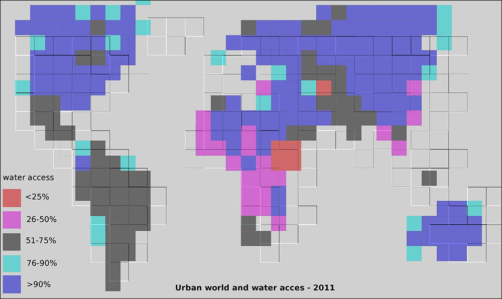
Infographic: A global comparison of water access and urbanized region. View the infographic in a new window. Click to enlarge.
This is a global overview of the water access (as a percentage of population) and of the urban factor. The color code refers to the water access factor, while the relief—or changes in three-dimensional height of the tiles on the graphic—refers to the rate of urbanization. (The higher the elevation, the more dense the urbanization.)
See the other winning designs here.
Did you miss your chance to participate? Designers can continue to share their visualizations throughout the year by uploading to visualizing.org.
