Posts
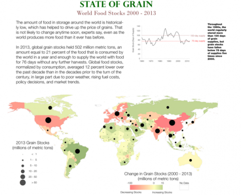
Infographic: World Food Supplies Concentrated in Brazil, China, Europe, India, and United States
0 Comments
/
The amount of food in storage around the world is on the rise, but stocks are still historically low.
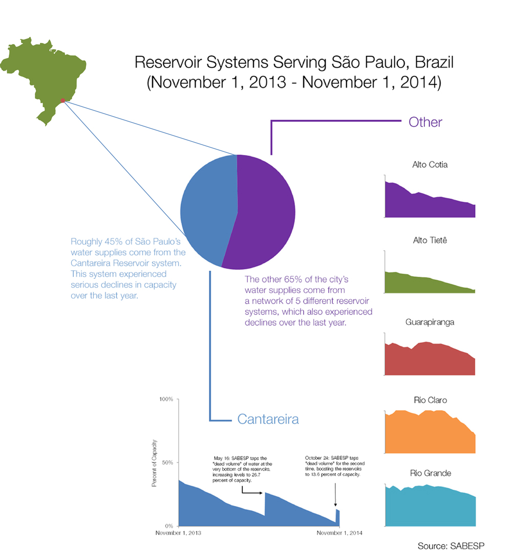
Infographic: Sao Paulo Drought Lowers Reservoirs to Critical Water Levels
The Cantareira reservoir water system that supplies half of Sao Paulo’s 20 million residents is now only 10 percent full after more than year of record-setting drought.
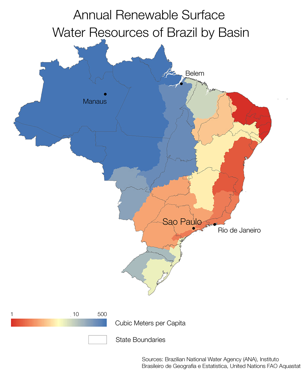
Infographic: Brazil’s Water Resources Far Away From Major Cities
Sao Paulo, the largest city in Brazil and the ninth largest in…
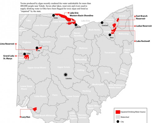
Infographic: Toxic Algae in Ohio Drinking Water Sources
Algae toxins have been found in seven lakes, reservoirs, and rivers that supply drinking water to 1 million people.

Map: Not All Phosphorus Is the Same
A breakdown of the different types of phosphorous in Ohio's Maumee and Sandusky rivers that have led to algal blooms in Lake Erie since the 1970s.
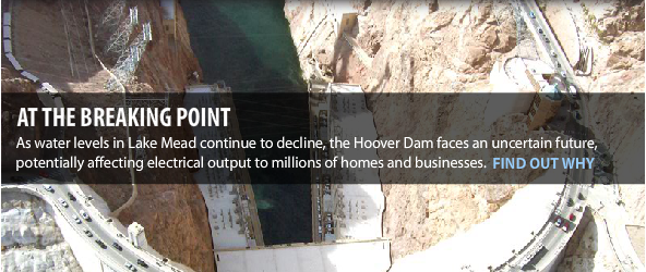
Infographic: Hoover Dam’s Troubled Waters
Completed in 1935, Hoover Dam supplies electricity to 29 million people in Arizona, California and Nevada.
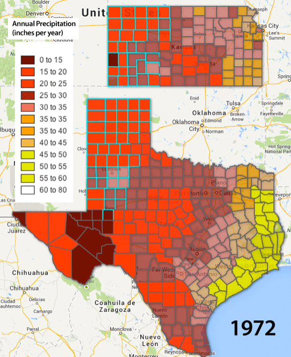
Infographic: Ogallala Precipitation in Motion — 72 Years Animated GIF (1940 – 2012)
When layered, maps of annual precipitation in Texas and Kansas show the stark moisture division in the United States between the wet East and the dry West running through the Great Plains.
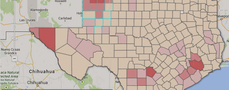
Map: Kansas and Texas Fresh Groundwater Use (1985-2005)
Click through the interactive Google Fusion Tables infographic to see how water use has changed over the last two decades, as well as how these trends relate to fluctuation of groundwater tables within the Ogallala Aquifer since the 1940s.

Map: California’s Water Use Per County (1985-2005)
Click through the interactive Google Fusion Tables infographic to see how California’s water use has changed over the last two decades and how these trends relate to population demographics and water contamination.
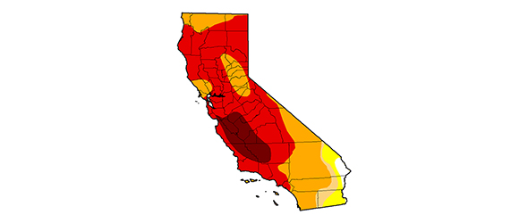
Infographic: California Drought In Motion — 10 Dry Years Animated GIF (2003-2014)
When layered, weekly images of the U.S. Drought Monitor for California show how much worse this drought is than any in the past decade.
Infographic: West Virginia Chemical Spill Spreads to Ohio River
Spill shut down drinking water for 300,000 people.
Infographic…

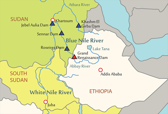
Infographic: Wealth of the Nile — Basin’s Countries, Dams, and GDP per capita
Controversy over the Grand Ethiopian Renaissance Dam, which will become the largest dam in Africa when it is completed in 2017, stems from a long history of disputes along the Nile River's 10 countries.

